Warframe
Screen Redesign
The goal of this project was to dissect and reverse-engineer one of Warframe’s most complex and information dense menus, the Upgrade/Modding screen. As a long time player, I have always heard modding has been a large obstacle to get new players familiar with. So I decided to make a project adding some clarity to some of the difficulties I know and have heard about.
Team Size: Solo
Timeframe: 3 Weeks
Roles: UI Design
Tools: Figma, Photoshop
Final Design
This project culminates in a high-fidelity UI/UX reconstruction that harmonizes raw structural blockouts with custom vector iconography and official game assets. Designed to prove mastery over complex, data-dense information architecture, the final design bridges the gap between clean structural layout and Warframe's highly stylized aesthetic across multiple operational states.
First Image, displays the finalized, high-fidelity main layout. This view brings together custom-reconstructed mod cards, a complete vector category filtering system, and intricate background circuitry connecting capacity to the mod slots.
By scaling from a simple geometric blockout to a fully realized screen state, this project showcases an end-to-end workflow in managing intricate asset pipelines, building scalable assets and balancing usability within AAA live-service menu systems.
Showcasing the expanded inventory drawer state.
Displays the finalized, high-fidelity main layout.
Early Blockout
Using the original in-game interface as a baseline, I developed a high-fidelity functional blockout to map out every interactive element—from stat scaling to the grids of individual mod cards—ensuring the wireframe maintained exact proportion and spatial relationships, while making adjustments to fit the planned changes.
Shows the original in-game UI reference used to analyze the user flow and data layout.
Showcases my wireframe blockout, where I translated the screen into clean, reusable structural components and placeholders.
Official assets
To ground the project in the true Warframe identity, I extracted and curated official game assets. High-density interfaces rely heavily on micro iconography and distinct shapes to keep players oriented, making this an essential step in the replication process.
Polarity and Ability Icons: The unique geometric glyphs used for mod card polarities and Warframe stat categories.
Currencies & Upgrade Items: Clean images of iconic items like Formas, Orokin Catalysts, and Arcanes.
Mod Card Frameworks: The foundational borders and backgrounds that give the mod cards their distinct structure.
Vector Asset Creation & Menu Overlay
Beyond breaking down the core layout, I wanted to practice asset recreation to ensure every custom built component met the exact visual language of Warframe’s UI. As mentioned before, high density screens rely on precise iconography, which required creation of several graphic assets from scratch.
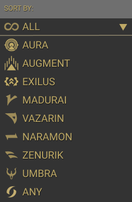
Sorting Overlay: showcases a custom dropdown overlay designed to map out the inventory's baseline sorting logic. For this component, I paired clean, polarity and category icons and precise layout padding to match the original style.
The Icons: A suite of custom vector art I created to represent different Warframe stats and attributes. Recreating these required a deep focus on maintaining a consistent clean style, geometric balancing, and matching the distinct, sharp-edged gold aesthetic used in the live game.
New Mod Filtering: demonstrates how these custom vector icons were implemented together with the official icons into the actual UI filter tabs. Mapping out both the individual stat filters and the broader combined category buttons.
By designing these custom assets and menus, I gained hands-on experience in creating clean, scalable vector assets that fit seamlessly into a highly specific, pre-existing art direction.


Mod Redesign
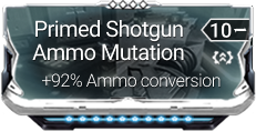
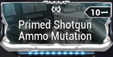
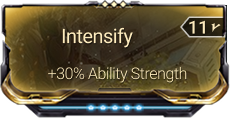
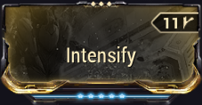
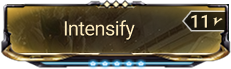
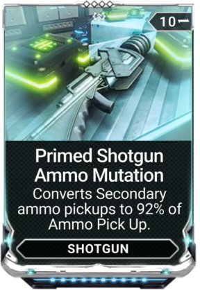
A crucial part of this project was rethinking how information is displayed on individual mod cards. Warframe’s inventory management requires players to , quickly scan card names, drainage costs, and ranks while dealing with limited screen real estate. I analyzed the Official In-Game Baseline (Left) and expanded with:
Redesigned States (Middle & Right): My iterations on the cards, showing specific core stat values alongside a condensed, ultra-streamlined variation designed to maximize screen real estate in dense grid layouts.
Large Hover Expansion (Bottom): A high-fidelity recreation of the full card overlay that triggers upon user hover just like in the game.

Takeaways
Solving Complex AAA Style Alignment
The most challenging aspect was recreating and designing custom icons from scratch. It required a lot of work to match the highly specific visual language and sharp geometric aesthetic already established within Warframe's UI.
Advanced Component Architecture in Figma
To manage the massive scale of the interface efficiently, I built the system using a large volume of reusable components and variants. Utilizing a component-driven workflow was essential for keeping the layout organized, scalable, and responsive across different menu states.
Enhancing Clarity for Core Progression Systems
The main UX goal was to improve the presentation of Warframe's restriction-heavy modding system. I focused on showing more vital information without overwhelming the user, providing easier access to core power-progression elements, and introducing Gameplay-related sorting options to clearly showcase the diverse ways players can empower their equipment.