The Last
Branch
The Last Branch is a beautiful third person adventure game inspired by Journey and the world of Ico. It was developed during a Game project from students as their first group project in Unreal Engine.
Roles: UI Design & lead, Tutorialization & Lighting
Tools: Figma, Photoshop, illustrator, Unreal, Perforce
Platform: PC
Engine: Unreal
Team Size: 18
Timeframe: 7 Weeks
My Responsibilities
UI lead
I was responsible for the structure, style and design
On this I worked closely with the UI programmer & the 2D artist
Tutorialization
& Checkpoints
I was responsible for structure, placement, instructions & icons for the tutorial
For this I worked closely with the level designer and the QA
Lighting
Our main artists were full on creating assets, so I took on the responsibility of adding lighting where needed
Working with the level designer to light important parts for guidance & clarity
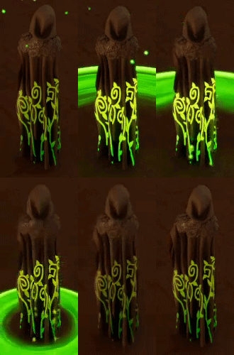
Diegetic UI Effect
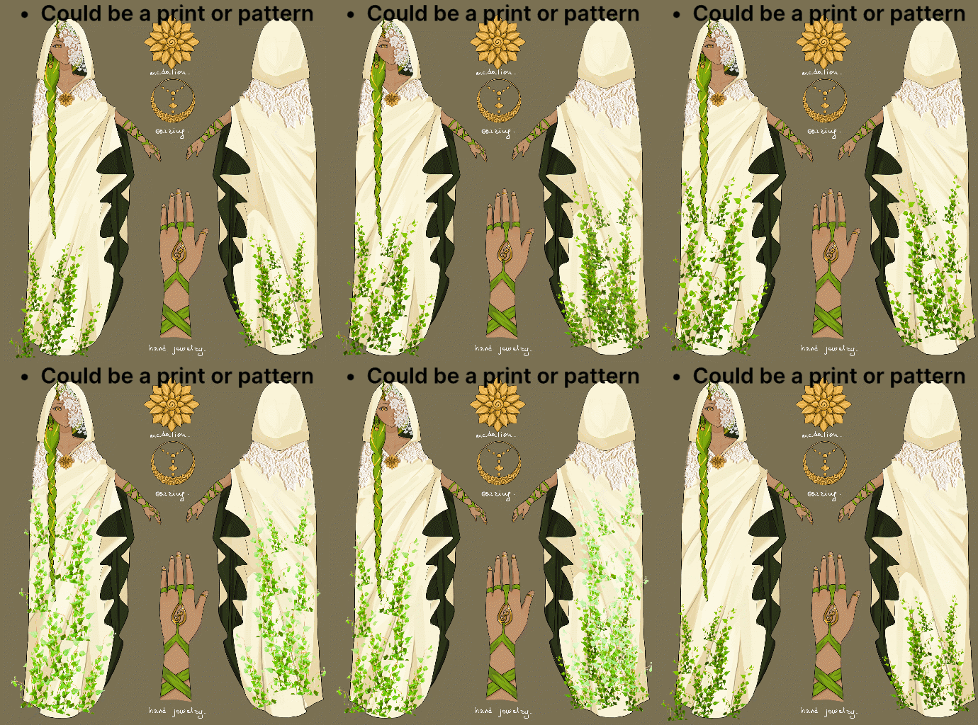
We knew early on that we wanted an immersive experience, with little to no in-game UI. As soon as we had a character design I started brainstorming different effects that could be used as a diegetic UI element for the duration and cooldown of the characters ability.
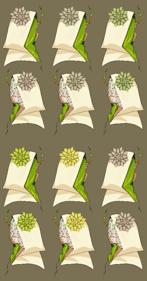
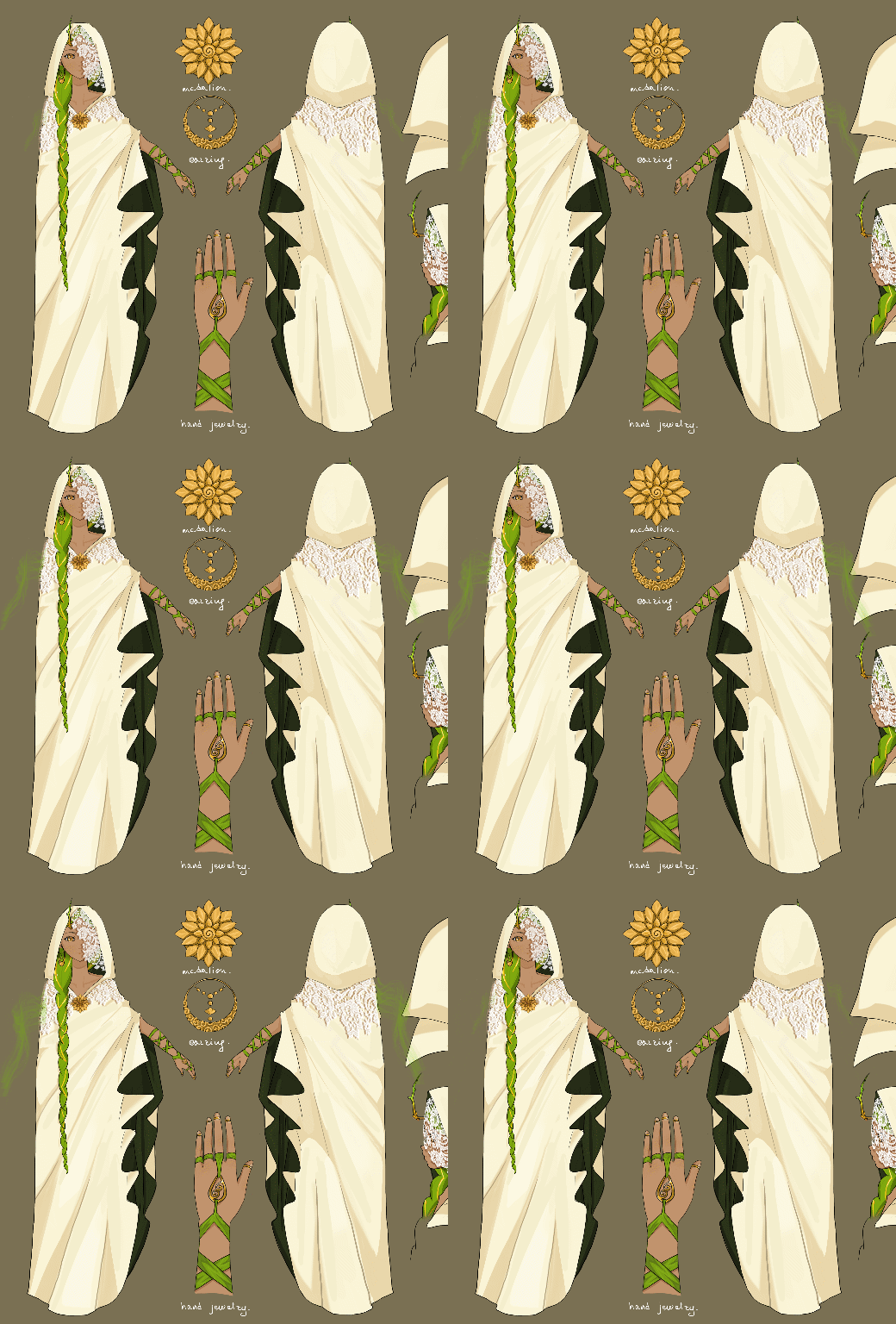
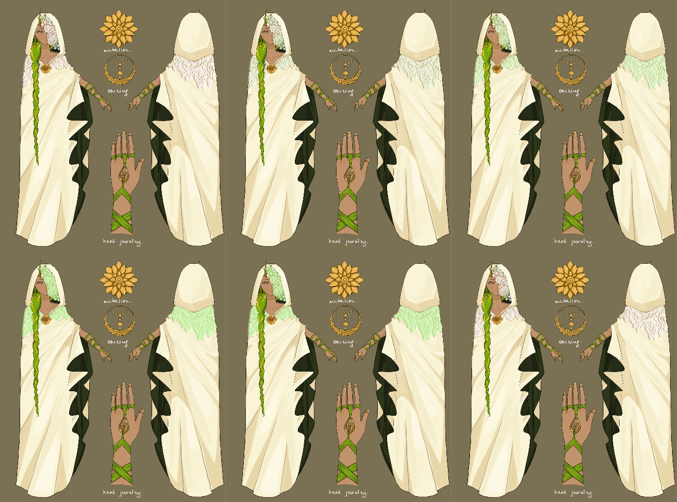
I made 5 quick mockups of ideas and polled the team. The Veil was the winning idea of the poll, with the cloak pattern as a close second. We tested the veil and eventually decided to go for the cloak pattern idea since it would be more visible and clear.
This is what the character artist and a programmer made for the final product, where I could tweak the glow effect and timing.

Screen Vignette Effect
An effect showing and pulsing when the character stands in the dangerous rot, showing like the rot is creeping in affecting the character.
I made a quick mockup of the idea and made an animation example in Figma. After approval from the producer and team I made the asset in Photoshop using branch motifs to keep the nature theme, but made it red to match the rot creeping in on the character when they stand in it. I worked with one of the technical designers to connect it to the gameplay.
This is what the final product I made ended up looking like in-game, where I could tweak the pulse and timing.
Tutorialization
I worked closely with out level designer to quickly brainstorm places and ways to add tutorial sections, where the player would have to interact with the systems to progress. Most of them were also designed as level design locks in both ways, to prevent unnecessary backtracking for the player.
Along with the tutorials, I was responsible for placing and adjusting the games checkpoints that was made by one of the technical designers. Since we wanted the game to have a fairly low difficulty, the checkpoints are generously placed along the players path. The checkpoints were placed and adjusted from a lot of internal and external testing. Along with the placing checkpoints I designed the Icon that flashes when you also trigger a checkpoint.
This is part what the UI artist refined and adapted to the theme of the final product, with the references I had designed.
Lighting
In early production we had a lot of trouble with the lighting system of Unreal Engine 5. Things glowing way to bright, barely showing while in the light or it getting extremely dark. This I later found out was the engines post-processing auto exposure. I tested a bunch of adjustments until we got a very low level of auto exposure we were happy with.
This also meant I had to light up all the dark sections of the game. But it was not only to light up areas, also to highlight spots to pull the players attention. To accomplish this I worked with the level designer and passed it by our environmental artist. In the more cave like area we decided to add small glowing mushrooms as a guide for the player.
Here bellow you see some examples of with and without the lighting I added.
Testing: Internal
And External
From the start of the project I was quick to test a lot of the things that were implemented and give constructive feedback. Sometimes even multiple of the group sat down and tested the builds.
We also had several external tests, a few with other students and two with testers coming from outside the education. I worked closely with our QA to prepare the testing setups, make questions and forms for feedback and compile notes. The feedback was compiled and sorted before given to the team, so it would be easy to find the relevant feedback for that discipline.
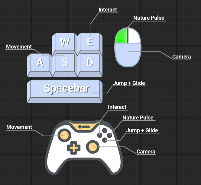
Here is a quick temporary control layout image that I made to make early external testing easier, before we had a tutorial set up.
Takeaways
Overall
I was happy with the project and what the team accomplished over those 7 weeks. Could it have been better, always. The game has one of the most cohesive aesthetics in any project I’ve worked on. The art, sound, and writing all feel in harmony with each other. I really enjoyed working closely with so many of the designers, the people working on the UI with me and the QA.
It was a new experience being the main responsible for all the UI and structuring things for others to work on. But it was a good learning experience, making lists and tasks for both yourself and others to work on.
The biggest thing I was less happy about with the project was that the same people were both producer and Product owners. This was assigned by the school themselves and not up to the group. So the project struggled having a clear vision
Communication. communication. communication.
Most of the group had a lot of communication, sat in discord for most of the work day could just mention something if needed.
But you also need to have written communication, in form of documentation. To let the ones who might not have been able to be there, know what choices/changes where made. And also ask people if you are the one who might not have been there at that time.
Focus on finishing your responsibility
Focus on making sure your primary responsibility is polished before taking on other larger tasks.
Since I took on the responsibility for fixing the lighting I feel like the quality of the final textbox UI suffered. I did not catch that the readability got worse when we changed over to the finished background asset. This happened partially because I was working on the lighting basically up until the end of the project.
So in the end I should have put the lighting to the side for a little bit, or asked if someone else might have the ability to work on it while I finished up the UI.