Dark Descent
Dark Descent is a Gloomy and stylized top-down game where you play as a templar thrown into Limbo. There you have to combine your three main parts of your faith, Holy, Fire and Order, all three will be needed against the onslaught of demons.
Roles: In-game UI Design, Tutorialization
Tools: Figma, Photoshop, Illustrator, Unity, Perforce
Platform: PC, Mobile
Engine: Unity
Team Size: 14
Timeframe: 5 Weeks
My Responsibilities
Tutorialization
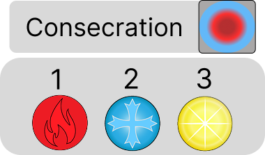
At the last parts of the development I was the one who put in our short tutorialization, introducing them to the spell system one step at a time.
In-Game UI
I had the responsibility to design and make assets for both the PC and Mobile in-game UI
Part of Spell system design
I worked together with the team to design a spell system that would be interesting but also plausible in the 5 weeks we had.
The Spell Trinity
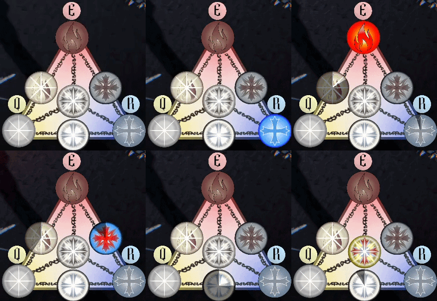
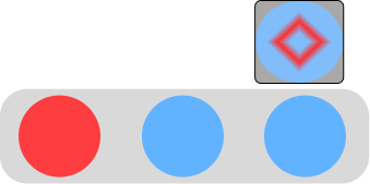
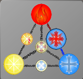
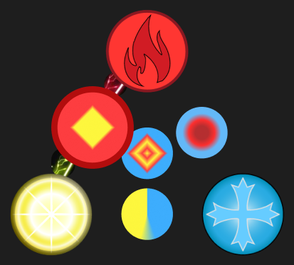
The Spell trinity as we decided to call it was one of the core parts of the game. It is where you would see your currently selected spells and cooldown.
There were a lot of iterations trying to find good ways to display the connections of activating more than one to combine into a new spell.
This is what I implemented in the final product with some help from one programmers linking it to the spell system. There was work on a system to highlight the links between the spells to add more clarity, but with lack of time it was not implemented.
Mobile UI
This was the first Mobile game the group made, but Unity made adapting it for mobile fairly easy.
But the UI needed to be changed to work with the touch screen. So I made two control sticks matching the style of the game, one for movement other for aiming where you shoot when you let go. The UI also needed a button for interacting and one for dashing.
It would have been nice to just have touch controls on the Spell Trinity, but for the lack of time we decided to make buttons to toggle the elements.
Takeaways
Visual Identity of Core Systems
I was incredibly proud of crafting the custom icons for the Spell Trinity. Giving a distinct look to the core pillars of the gameplay—Holy, Fire, and Order—helped ground the UI directly into the game’s gloomy, stylized aesthetic.
Seamless Mobile Adaptation
Despite this being our team's first venture into mobile, I successfully overhauled the control scheme by implementing a stylized twin-stick layout and contextual action buttons that felt native to touch screens.
Designing Around Scope
Time is always the ultimate boss. In a 5-week sprint, we had to make the hard choice to drop dynamic link-highlighting and direct touch controls for the Spell Trinity in favor of a reliable toggle-button system. This tight timeline also forced us to streamline the tutorial, prioritizing a lean, essential onboarding experience over a advanced polished one to meet our deadline.